Submit the following assignments via the honors section of Gradescope.
- HC 1: Team Contract and Introduction to the Opportunity Atlas
Due Date: September 9
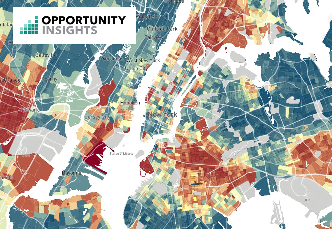
Throughout the semester, we will analyze data from the Opportunity Atlas, a landmark research project by economists Raj Chetty, Nathaniel Hendren, John Friedman, Maggie Jones, and Sonya Porter. The Atlas tracks the long-term outcomes (income in adulthood, incarceration rates, college attendance) of children who grew up in every Census tract in the United States, broken down by parental income, race, and gender. It allows us to ask a simple but profound question: does the neighborhood where you grow up shape where you end up in life?
Step 1 — Project structure:
You will work in teams. Each team will be assigned one of the five NYC boroughs to analyze, and each team member will focus on a neighborhood within that borough. Throughout the semester, your team will build up a borough-level analysis while each of you contributes a neighborhood-level case study. These will come together in a showcase presentation at the end of the semester.
The dataset for this project is fixed: you will use the Opportunity Atlas tract-level outcomes file (tract_outcomes_simple.csv), merged with the 2010 Census tract centroid file for New York (CenPop2010_Mean_TR36.txt), which provides the latitude and longitude of each Census tract. Download both files now and keep them for the rest of the semester.
Step 2 — Choose your neighborhood:
With your team, decide which neighborhood each member will focus on. Each neighborhood should be different, and together your neighborhoods should be reasonably representative of the borough. Pick a neighborhood you know or are curious about. You will identify the Census tract(s) that correspond to your neighborhood in HC 2.
Step 3 — Team Contract:
Work with your assigned team to fill out the Team Contract Google Form, which will guide you through agreeing on roles, communication, and expectations for the semester.
Group submission: one submission per team.Step 4 — Dataset Summary:
Read the non-technical summary of the Opportunity Atlas paper and write a short paragraph (3–5 sentences) in your own words explaining what the Atlas measures and why it matters. Submit your paragraph as a .pdf to the assignment HC1 - Dataset Summary in the honors section of Gradescope.
Individual submission: one submission per student.
- HC 2: Portrait of a Neighborhood
Due Date: September 16
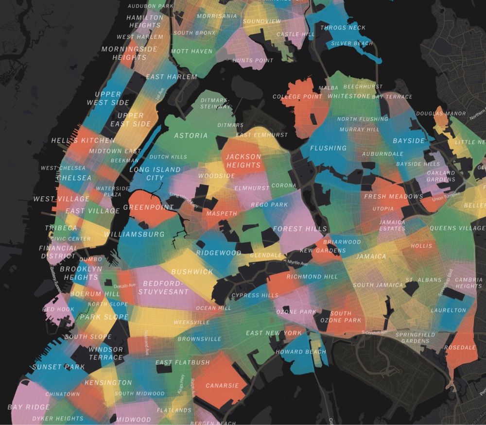
Image Credits: https://asktheman.xyz/
Each student will create a one-page PDF profile of their chosen neighborhood. Your summary must include at least the following:
- The name of the neighborhood (include in the title). Use the official NYC Neighborhood Tabulation Area (NTA) name where possible.
- The Census tract number(s) that correspond to your neighborhood. To find all tracts in your neighborhood, use the NYC Census Tract to NTA crosswalk: search for your neighborhood name in the NTAName column and collect all associated tract IDs. You can also use the Opportunity Atlas map to visually confirm which tracts fall within your neighborhood boundaries.
- The zip code(s) of your neighborhood
- A map of New York City with your neighborhood highlighted
- A photo or image that captures your neighborhood
- The demographics of your neighborhood (population, racial composition, median household income)
Your summary should exceed these minimum requirements to receive full credit. Include any context you think will be relevant to the future analysis, for example, historical background, notable institutions, or economic characteristics. A great resource is Census Reporter: search for your neighborhood name to find demographic data organized by Census tract.
Individual submission: Submit a .pdf file containing your summary to the assignment HC2 - Portrait of a Neighborhood in the honors section of Gradescope.
- HC 3: What is Economic Mobility?
Due Date: September 23
Image Credits: https://www.mjeconomics.com/
This assignment asks you to build a shared understanding of the Opportunity Atlas and the concept of intergenerational economic mobility.
Working as a group, research and answer the following questions:- What does intergenerational economic mobility mean? What does it mean for a neighborhood to have "high" or "low" opportunity?
- What outcomes does the Opportunity Atlas measure, and how were they computed? (Who are the children in the data? When were their incomes measured?)
- What does the variable kfr_pooled_pooled_p25 represent? Explain it in plain English, as if to someone who has never heard of the Atlas.
- What does it mean that the data is organized at the Census tract level? How large is a typical Census tract?
- What did the researchers find about how much outcomes vary across nearby neighborhoods in the US? Does geography matter?
- What are some limitations or caveats of the data that we should keep in mind as we analyze it? (Hint: check the Atlas FAQ.)
You may collaborate using a Google Doc, Miro, or Padlet (both have free plans).
Group submission: Submit a single .pdf written in essay form (not a disconnected list of answers), with your sources cited, to the assignment HC3 - What is Economic Mobility? in the honors section of Gradescope. One submission per team.
- HC 4: Opportunity in My Borough
Due Date: September 30
Building on HC 3, your team will now focus its research on your assigned borough. Browse news articles, policy reports, and public data to characterize what is known about economic opportunity, inequality, and neighborhood outcomes in your borough. Your report should address questions such as:
- Which neighborhoods within your borough are known for stronger or weaker economic outcomes, and why?
- What historical factors — such as redlining, public housing policy, school quality, or immigration patterns — have shaped opportunity in your borough?
- Are there recent policy initiatives aimed at improving opportunity in your borough? What do they target?
- How does your borough compare to the other four in terms of median income, poverty rate, and racial composition?
Grading criteria:
- Group gathers and reports on facts and data specific to their borough.
- Group cites sources in support of their findings.
Group submission: Submit a single .pdf report written in essay form, with citations, to the assignment HC4 - Opportunity in My Borough in the honors section of Gradescope. One submission per team.
- HC 5: Neighborhood Spotlight — Image Processing
Due Date: October 7
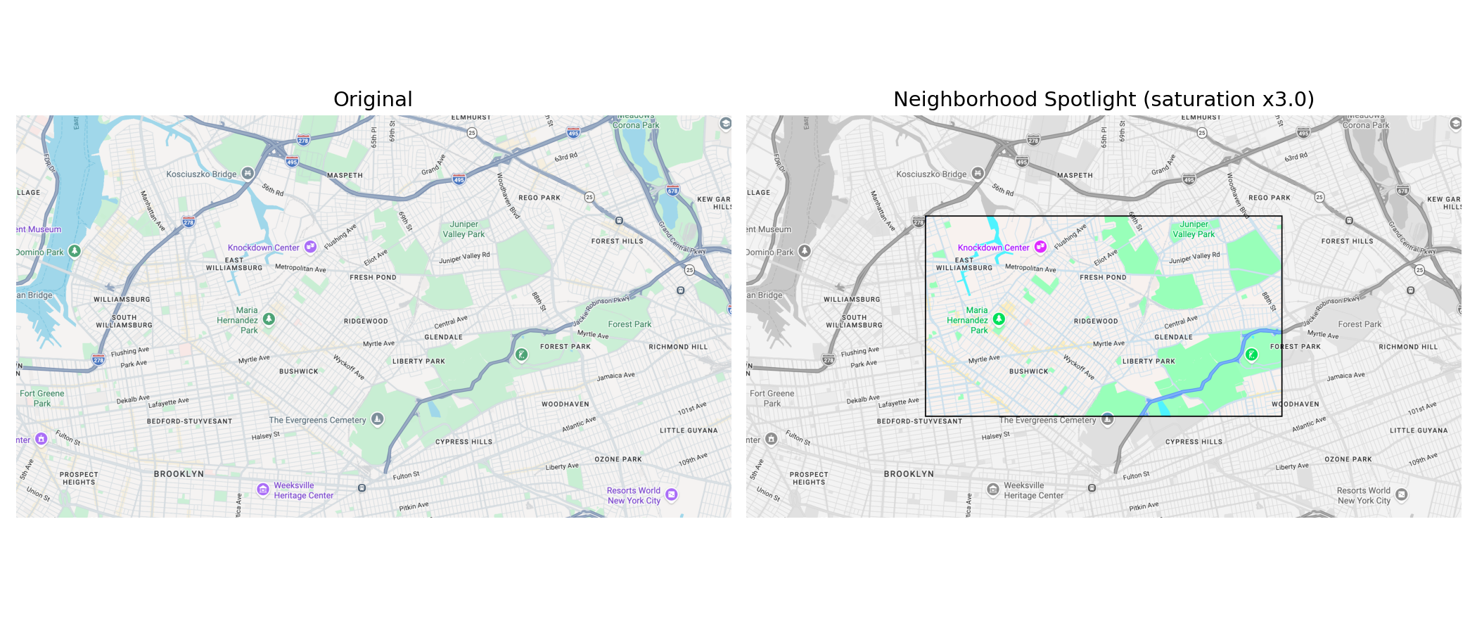
For this assignment, you will create a spotlight visualization of your neighborhood: a satellite map image in which everything outside a central rectangular region is converted to grayscale, while the colors in the spotlight area are amplified and a black bounding box is drawn around it. You will write a single Python script that loads the image, processes it with array slicing, and saves one output image. The idea is to gray out the whole image, then paint the spotlight back in with amplified color, and finally draw the box.
Load the image and set up the spotlight. Start by downloading a .png map image of your neighborhood from Google Maps, zoomed to a level where your neighborhood fills the frame. Ask the user for the input filename and the output filename with input(), then load the image using plt.imread(), which returns a NumPy array of shape height × width × 3 with float values in [0, 1] for PNG files:
in_file  = input('Enter the name of your image file: ')
out_file = input('Enter the name for your output file: ')
img = plt.imread(in_file)
Make a writable copy to modify (call it result), and read the image dimensions from img.shape. Then define your spotlight boundaries as fractions of the image dimensions, for example the top and bottom of the spotlight at one-quarter and three-quarters of the height, and similarly for the left and right edges:height = img.shape[0] width = img.shape[1] top = height // 4 # Define bottom, left, and right in the same way
Use // (integer division) here, not /, because an array index has to be a whole number.Step 1 — grayscale the whole image. A grayscale pixel has the same value in all three color channels. That value is the pixel's luminance, computed with the weighted formula L = 0.299*R + 0.587*G + 0.114*B. Because the red, green, and blue channels are the three "layers" of the array (img[:, :, 0], img[:, :, 1], and img[:, :, 2]), you can compute the luminance for every pixel at once and then copy it into all three channels of result:
L = 0.299 * img[:, :, 0] + 0.587 * img[:, :, 1] + 0.114 * img[:, :, 2]
result[:, :, 0] = L
# Set the other two channels to L as well
Once all three channels hold L, the entire result image is gray.Step 2 — paint the spotlight back in with amplified color. Now think about what luminance actually captures. L is the gray equivalent of a pixel, so channel - L measures how far that channel is from gray, and that deviation is what carries the color. Before writing any code, work through the following:
- For a pixel (R, G, B) with luminance L, what is R - L? G - L? B - L? What are these values for a pixel that is pure gray?
- What does L + 0 * (R - L) give for each channel? What about L + 1 * (R - L)? Do the results surprise you?
- What would L + 2 * (R - L) give?
To amplify the color, set each channel to L + factor * (channel - L) for the central region only, using a factor greater than 1. Multiplying the deviation by a factor larger than 1 can push a channel value below 0 or above 1, so wrap the result in numpy.clip(array, 0, 1), which caps every value to the valid range (anything below 0 becomes 0, anything above 1 becomes 1). Compute the luminance of the central slice and assign the boosted, clipped values back into that same slice of result:
factor = 3.0
center = img[top:bottom, left:right]
Lc = 0.299 * center[:, :, 0] + 0.587 * center[:, :, 1] + 0.114 * center[:, :, 2]

result[top:bottom, left:right, 0] = np.clip(Lc + factor * (center[:, :, 0] - Lc), 0, 1)
# Do the same for channels 1 and 2
Try factor values of 0, 0.5, 1, 1.5, 2, and 3 and describe what you observe in each case. Which gives the strongest contrast between the spotlight and the gray border? Use a factor of 3 for your final image so the spotlight colors are strongly amplified.Step 3 — draw the black bounding box. To make the spotlight stand out, draw a black box along the four edges of the central rectangle. Pick a thickness of a few pixels, then set those edge strips to black by assigning 0 to the first three channels of each strip. The top edge is a strip a few rows tall spanning the width of the spotlight, the left edge is a strip a few columns wide spanning its height, and similarly for the bottom and right:
thickness = 4
result[top:top + thickness, left:right, :3] = 0   # top edge
# Now draw the bottom, left, and right edges the same way
Draw the box last, so it sits on top of the amplified colors.Save your result. Save the finished image as a single .png file using the output filename you read earlier: plt.imsave(out_file, result).
Individual submission: Submit a .pdf file containing your Python code and both the original and processed images side by side to the assignment HC5 - Neighborhood Spotlight in the honors section of Gradescope.
- HC 6: First Look at the Data
Due Date: October 15 — IN LAB
In this guided in-lab session, you will load, merge, and begin exploring the two datasets at the core of your project. Work through the provided Jupyter notebook, which will walk you through the following steps:
- Load tract_outcomes_simple.csv (the Opportunity Atlas outcomes) and CenPop2010_Mean_TR36.txt (the Census tract centroids) into pandas DataFrames.
- Merge the two DataFrames on the county and tract FIPS codes to add latitude and longitude to each tract's outcome data.
- Filter the merged DataFrame to NYC's five boroughs using their county FIPS codes (005 = Bronx, 047 = Brooklyn, 061 = Manhattan, 081 = Queens, 085 = Staten Island).
- Inspect the resulting DataFrame: how many tracts does each borough have? What do the key columns look like? Are there missing values?
- Run describe() on the main outcome variable (kfr_pooled_pooled_p25) for your borough and discuss what you observe.
By the end of the session, your team should have a clean, NYC-filtered DataFrame and a shared plan for what you want to investigate in HC 7.
Group submission: Submit a .pdf outlining your team's plan for HC 7 to the assignment HC6 - Borough Analysis Plan in the honors section of Gradescope. One submission per team.
- HC 7: Borough Data Analysis
Due Date: October 28
Using the merged dataset from HC 6, your team will produce a full data analysis of your borough. The analysis has two components:
- Group component: Analyze your borough as a whole and compare it to the other four boroughs. What is the distribution of mobility outcomes across tracts in your borough? How does it compare to the city-wide picture?
- Individual component: Each student digs deeper into their own neighborhood's Census tracts. What are the mobility outcomes for your specific tracts? How do they compare to the borough average?
Your analysis must go beyond describe() output. Observations should be supported by statistics and at least 6 visualizations across at least 3 different plot types. Every plot must be accompanied by a written paragraph explaining what you observe — not just what the code does, but what the finding means.
You will submit your work as a Jupyter notebook (.ipynb), the same notebook in which you obtain the data, compute the statistics, and produce the plots. The discussion described above should appear in the notebook as markdown cells that alternate with the code cells: after each block of code that produces a statistic or a plot, include a markdown cell that discusses what it shows. The notebook should read as a narrative in which code and written analysis are interleaved, not a wall of code followed by a separate write-up. You must save the notebook with output in order to receive full credit. A notebook whose outputs are not saved and visible for grading will be penalized by 50%.
Grading criteria:
- Provides statistics for the borough/neighborhood and discusses observations in writing. Anomalous values should be noted and discussed.
- Makes observations that go beyond what describe() alone would reveal.
- Provides and discusses at least 6 visualizations across at least 3 plot types.
- Extra credit: Connects data findings to the historical/policy research from HC 3 and HC 4, supported by at least one plot. (5 points)
Group submission: Submit your group notebook (.ipynb) to the assignment HC7 - Borough Data Analysis (Group) in the honors section of Gradescope. One submission per team.
Individual submission: Submit your individual notebook (.ipynb) to the assignment HC7 - Neighborhood Data Analysis (Individual) in the honors section of Gradescope. One submission per student.
- HC 8: One Block Can Make a Difference
Due Date: November 4
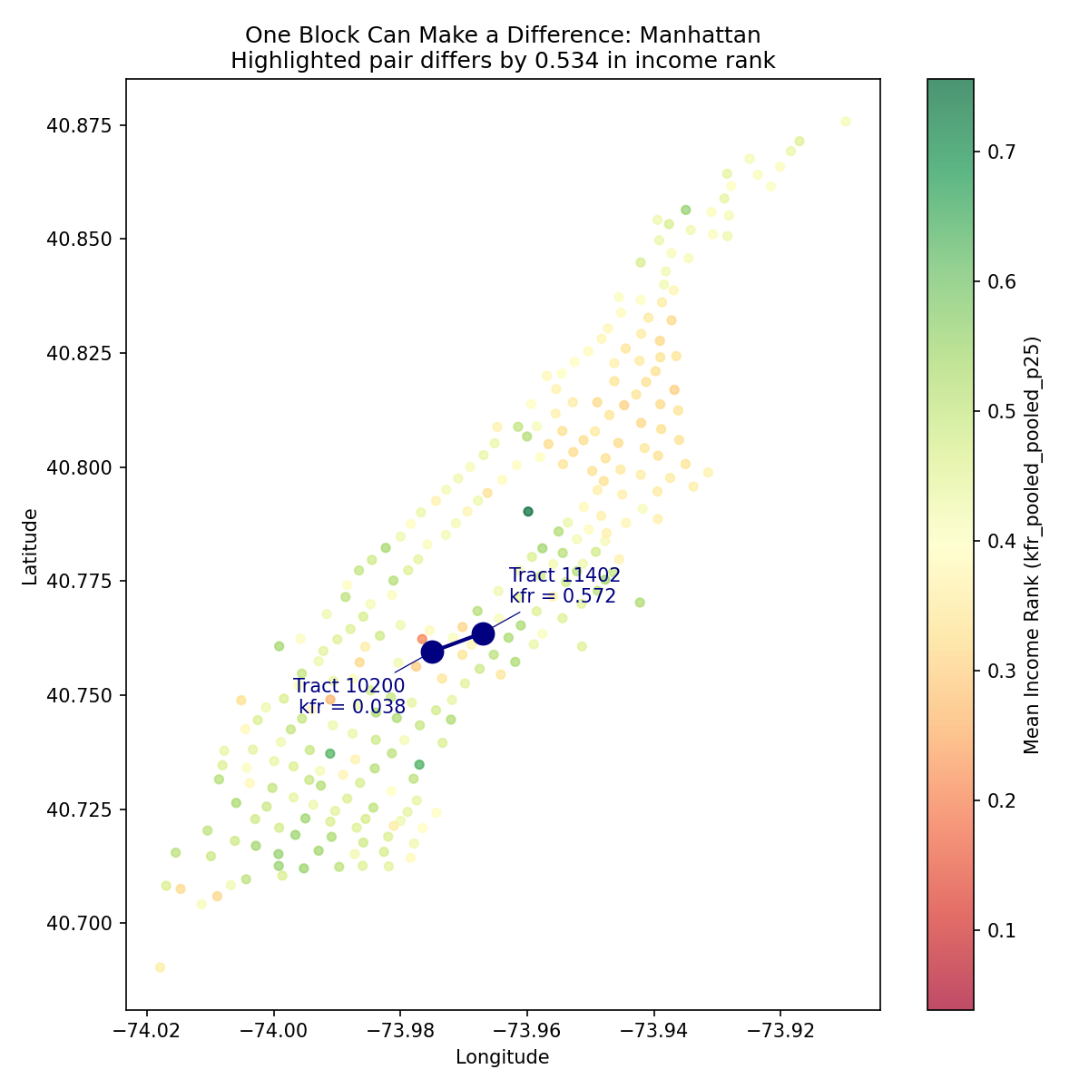
One of the Opportunity Atlas's most striking findings is that neighboring Census tracts can have dramatically different outcomes: children who grew up just one block apart may end up with very different adult incomes. In this assignment, you will look for evidence of this pattern in your borough by pair-programming with your team-mate to develop a Python program.
To do this:
- Write a function distance(lat1, lon1, lat2, lon2) that computes the distance in
kilometers between two points given their latitude and longitude coordinates, using the
Haversine formula
(a useful reference: Wikipedia).
The Haversine formula, with latitude written as φ, longitude as λ, and the Earth's
radius R taken as 6371 km, is
a = sin²(Δφ/2) + cos φ1 · cos φ2 · sin²(Δλ/2)
where Δφ is the difference of the two latitudes and Δλ the difference of the two longitudes. The trigonometric functions expect their arguments in radians, so both the latitudes and the longitudes (which the dataset stores in degrees) must be converted first. You can get the math functions you need with from math import radians, sin, cos, sqrt, atan2, where radians(x) converts a value x from degrees to radians. Test your function on a few known pairs of locations (for example, Hunter College at (40.7678, -73.9647) to the Empire State Building at (40.7484, -73.9857) is about 2.8 km).
d = 2R · atan2(√a, √(1−a)) - Using the distance function, write a main() function that asks the user for the borough, and
identifies all pairs of Census tracts in your borough whose centroids
are within 1 km of each other (i.e., neighboring tracts).
- Load the clean NYC dataset you saved in HC 6; your program must read it under the name nyc_opportunity.csv, from the same folder as your program, so rename your copy if you saved it as something else.
- Select only the rows for your borough. Note that once you select the rows for your borough, those rows keep the row numbers they had in the full dataset (Manhattan's start at 1087, not 0), so renumber them from 0 with borough = borough.reset_index(drop=True) before the loops. You must also drop any rows where kfr_pooled_pooled_p25 has no value, by using dropna().
- To compare every pair, use a nested loop over the tracts where the inner loop starts one position past the outer one (if the outer index is i, let the inner index j run from i + 1 onward). That way each pair is checked exactly once and no tract is ever compared with itself.
- For each such pair, compute the distance using your distance() function as well as the absolute difference in kfr_pooled_pooled_p25. Keep in mind that the distance and this difference are two separate quantities: the distance is only used to decide whether a pair counts as neighbors (within 1 km), while the absolute difference in kfr_pooled_pooled_p25 measures how far apart their outcomes are. In other words, you filter pairs by distance, then rank the pairs that survive by their outcome difference.
- Find the pair (within distance <=1.0) with the largest difference. Where are these tracts? What do you know about these neighborhoods from your earlier research?
- Have your program compute and print a short summary for your borough: the two tracts making up the largest-gap pair together with their kfr_pooled_pooled_p25 values, the number of tracts analyzed, the number of neighboring pairs (within 1 km), the maximum outcome gap, the number of neighboring pairs with a gap of at least 0.20 and at least 0.30, and the distance between the largest-gap pair.
- Print only this summary: do not print a line for every neighboring pair you find, since there are thousands of them. These are the numbers that let you compare your borough to the others in your discussion, so different boroughs will print very different summaries.
For example, running the program on Manhattan prints a summary like this (if your borough is not Manhattan, your numbers will look quite different):
  Enter your borough: Manhattan
  Largest-gap pair: tract 10200 (kfr = 0.038) and tract 11402 (kfr = 0.572)
  Tracts analyzed:          280
  Neighbor pairs (<= 1 km): 1933
  Max gap:                  0.534
  Pairs with gap >= 0.20:   61
  Pairs with gap >= 0.30:   21
  Top pair distance:        0.81 km
Program structure requirements:
- Organize your program into functions. The distance calculation must live
in the distance(lat1, lon1, lat2, lon2) function described above, and everything else (asking for the borough,
loading and cleaning the data, searching for neighboring pairs, computing the statistics and printing them)
must go inside a main() function. At the very bottom of your program, call main() from
inside the standard __main__ guard, so it runs when you run the file directly:
if __name__ == "__main__":
    main()
Discussion: Write a short paragraph interpreting your finding. Some boroughs are more internally divided than others: in some you will find neighboring tracts whose outcomes differ dramatically, while in others even the largest gap between neighbors is modest and nearby tracts look much alike. Either result is meaningful, so let your data tell you which one your borough has. If you found a striking contrast, what might explain why two tracts so close together diverged so sharply? If instead your borough's neighbors look broadly similar, what does that sameness tell you? In either case, discuss what your result says about your own neighborhood, drawing on what you learned in your earlier research: where do your neighborhood's tracts sit in this analysis, and what does that reveal about the place you are studying?
Group submission: This assignment has two separate submissions in the honors section of Gradescope, one per team. Submit your team's Python program as a .py file to the assignment HC8 - Program, and submit a .pdf containing your written interpretation to the assignment HC8 - Discussion.
- Write a function distance(lat1, lon1, lat2, lon2) that computes the distance in
kilometers between two points given their latitude and longitude coordinates, using the
Haversine formula
(a useful reference: Wikipedia).
The Haversine formula, with latitude written as φ, longitude as λ, and the Earth's
radius R taken as 6371 km, is
- HC 9: Mapping Opportunity with Plotly
Due Date: November 11
Using the latitude and longitude coordinates from the merged dataset, you will create an interactive Plotly scatter map of your borough in which each Census tract appears as a marker colored by its mobility outcome (kfr_pooled_pooled_p25). Keep in mind that these coordinates are tract centroids, a single representative point (the population-weighted center) for each tract, so your map shows opportunity at these locations, not spread across the tract's actual area. A large, sparsely populated tract and a small, dense one both appear as a single dot.
To do this:
- Filter the merged DataFrame to your borough.
- Create a Plotly Express scatter map (px.scatter_mapbox) with one marker per tract, using LATITUDE and LONGITUDE for position and kfr_pooled_pooled_p25 for color. Use a color scale that makes high and low values visually distinct.
- Add hover text so that mousing over a marker shows the tract ID and the outcome value.
- Save the map as an HTML file (you will embed it in your webpage in HC 12).
Write a short paragraph interpreting the geographic pattern. Does opportunity cluster in particular parts of your borough? Does the map match what you found in your HC 4 research?
Individual submission: Submit a .pdf containing your Python code, a screenshot of the map, and your written interpretation to the assignment HC9 - Mapping Opportunity with Plotly in the honors section of Gradescope.
- HC 10: Mobility Simulation
Due Date: November 18
The Opportunity Atlas tells us the average adult income rank for children who grew up in each tract — but individual outcomes vary around this average. In this assignment, you will write a simulation that models this variability and uses random numbers to explore what outcomes look like for a large number of hypothetical children from different neighborhoods.
To do this:
- Choose three Census tracts from your borough: one with a high mobility score, one with a low score, and one in the middle.
- For each tract, use random.gauss(mean, std) to simulate the adult income rank of 10,000 hypothetical children, using kfr_pooled_pooled_p25 as the mean and kfr_pooled_pooled_p25_se as the standard deviation. Clip simulated values to the range [0, 1] since income ranks are bounded.
- Plot the three distributions as overlapping histograms on the same figure, with a different color for each tract.
- Compute and report: what fraction of simulated children from the low-opportunity tract exceed the mean outcome of the high-opportunity tract?
Write a short paragraph reflecting on what the simulation reveals. What does overlap between the distributions mean? What would it mean if the distributions did not overlap at all?
Individual submission: Submit a .pdf containing your Python code, histogram, and written reflection to the assignment HC10 - Mobility Simulation in the honors section of Gradescope.
- HC 11: Neighborhood Webpage
Due Date: December 2

In this two-part assignment, you will build an individual page for your neighborhood and then collaborate with your team to create a shared borough project site.
Individual component — Neighborhood page:
Create a GitHub Pages site for your neighborhood. It should include:
- The name of the neighborhood and its Census tract(s)
- The spotlight map image from HC 5
- The demographic profile and background from HC 2
- A paragraph summarizing the key concepts from HC 3
- A paragraph summarizing your borough-level research from HC 4
- Key statistics and plot images from HC 7
- Your "one block" finding from HC 8
- The Plotly map from HC 9, embedded as an iframe (see below)
Group component — Team project website:
Working with your team, create a shared GitHub Pages site for your borough project. The team site should include:
- A brief introduction to the Opportunity Atlas and the research question your team investigated
- A summary of your borough-level findings from HC 7
- Links to each team member's individual neighborhood page
One team member should host the repository; the others can contribute via pull requests or by being added as collaborators.
To embed an HTML file as an iframe, use the following tag (assuming your map file is called mymap.html and lives in the same directory as your page):
<iframe src="mymap.html" width="600" height="400" frameborder="0"
  marginwidth="0" marginheight="0" allowfullscreen></iframe>
If you are using Markdown, wrap the iframe tag in <dl> tags:<dl> <iframe src="mymap.html" width="600" height="400" frameborder="0" marginwidth="0" marginheight="0" allowfullscreen></iframe> </dl>
Useful links:
Submissions:
- Individual: Submit a .pdf containing the URL of your neighborhood page and a screenshot to the assignment HC11 - Neighborhood Page in the honors section of Gradescope.
- Group: Submit a .pdf containing the URL of the team project site and a screenshot to the assignment HC11 - Team Project Website in the honors section of Gradescope. One submission per team.
- HC 12: Draft Presentation, Peer Feedback & Team Evaluation
Due Date: December 3 — IN LAB
In this in-class session, teams share their work with each other in a walk-around format. Each team sets up at a station with their project website open and their two slides ready. As other teams visit your station, give them your 3–5 minute presentation covering: who is on the team, which neighborhoods were studied, a key finding from the data, and a link to the project website.
As you visit other teams, pay attention to both their presentation and their project website. Take notes on what works well and what could be improved, considering the clarity of the analysis, the quality of the visualizations, and how well the website communicates the findings to a general audience. Be ready to share your observations as constructive verbal feedback on the spot.
Finally, each student will complete the peer evaluation Google Form assessing each member of their own team's contributions over the semester, as outlined in the Team Contract.
Submissions:
- Group: Submit your presentation slides (.pdf, 2 slides) to the assignment HC12 - Presentation Slides in the honors section of Gradescope. One submission per team.
- Individual: Complete the peer evaluation Google Form.
- HC 13: Final Showcase Presentation
Due Date: December 10 — IN LAB
Each team will deliver a 5-minute final presentation (2 slides from HC12) summarizing their semester-long investigation into economic opportunity in their borough. Presentations should incorporate feedback received in HC 12.
After the presentations, the class will break into small groups for a poster-session style showcase: each team uses their project website to walk visitors through their work, fielding questions about their methodology, findings, and what surprised them most. Visitors may include invited guests from outside the class.
Grading reflects both the prepared presentation and the quality of the interactive discussion.